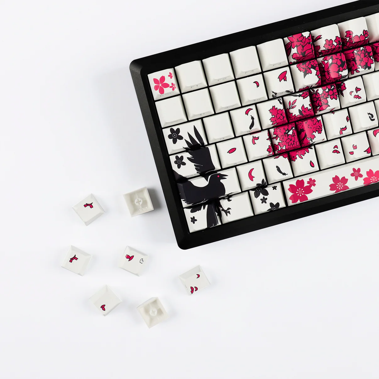
A keyboard can be more than a tool—it can be the mood board of your desk. Swap the caps, and the whole scene shifts: brighter mornings, calmer afternoons, a hit of playfulness for late-night sessions. The new-arrival key sets from YMDK lean into that feeling. They’re about color that matches your space, textures that feel good at your fingertips, and legends that look crisp at a glance. Not specs; not measurements; just the way your setup looks and the way typing feels.
In this article, we’ll tour the style possibilities inside YMDK’s latest drops and help you pair them with your desk, lighting, and daily routine. You’ll discover versatile color stories (from ultra-clean monochrome to retro warmth to bold pops), ideas for blending caps with cases and mats, plus simple care habits to keep everything looking “fresh out of the box” long after unwrapping.
Why Looks Matter More Than Numbers (Here)
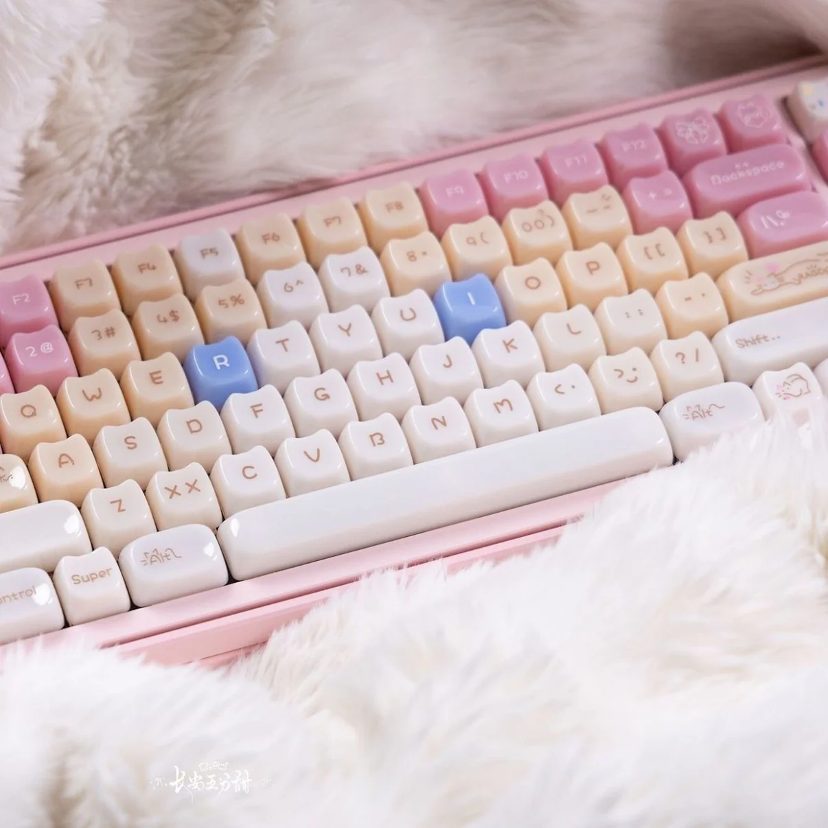
There’s a reason you notice a keyboard first in a photo of a great workspace: it sits at the composition’s center, pulling focus like a piece of jewelry for your desk. YMDK new-arrival key sets respect that role. Instead of drowning you in technicalities, think in feelings: calm vs. energetic, modern vs. nostalgic, soft vs. graphic. When the key set matches the vibe of your chair, lamp, and notebook stack, the whole arrangement clicks—and you’ll actually want to sit down and create.
Three Style Directions from YMDK New Arrivals
Minimal Monochrome (the “I mean business” desk)
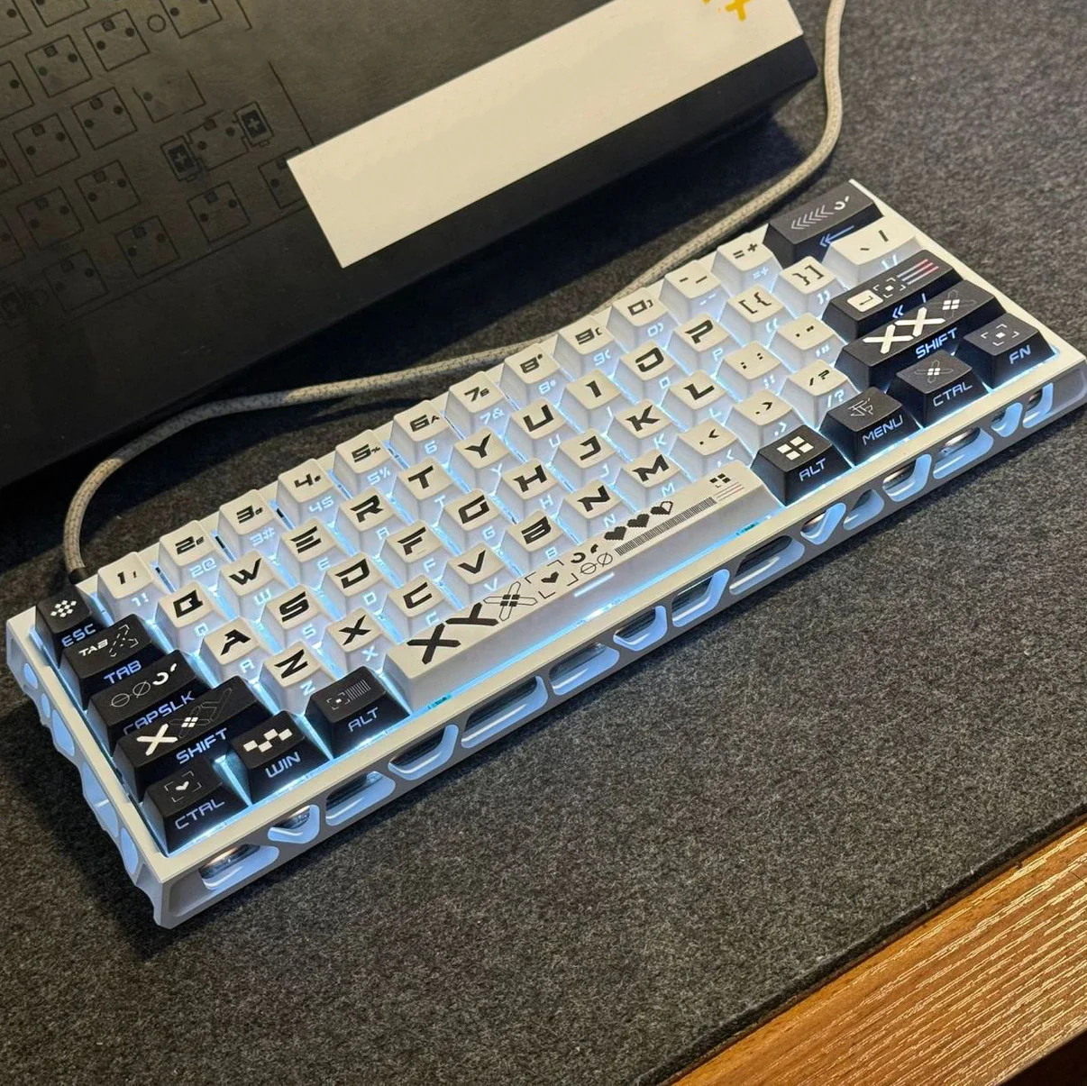
Smooth, uniform color—ink black, stone grey, or cloud white—cleans up visual noise in seconds. On a dark case, deep monochrome feels like a single sculpted object; on a silver or white case, pale caps read airy and weightless. Choose this path if your space skews modern, with slim monitors, linear shelving, and a neutrals-first palette. It’s the easiest way to make meetings feel composed and writing sessions feel uninterrupted.
Retro Warmth (the “creative studio” energy)
Creams, butterscotch notes, soft olives—tones that echo vintage typewriters and mid-century decor. These YMDK sets pair beautifully with walnut desks, linen pinboards, and warm desk lamps. Think Sunday-afternoon editing, sketching, or journaling. If your room has a beloved guitar in the corner or a gallery wall with matte frames, retro warmth will feel native to the scene.
Playful Color Pop (the “ideas at 3 p.m.” spark)
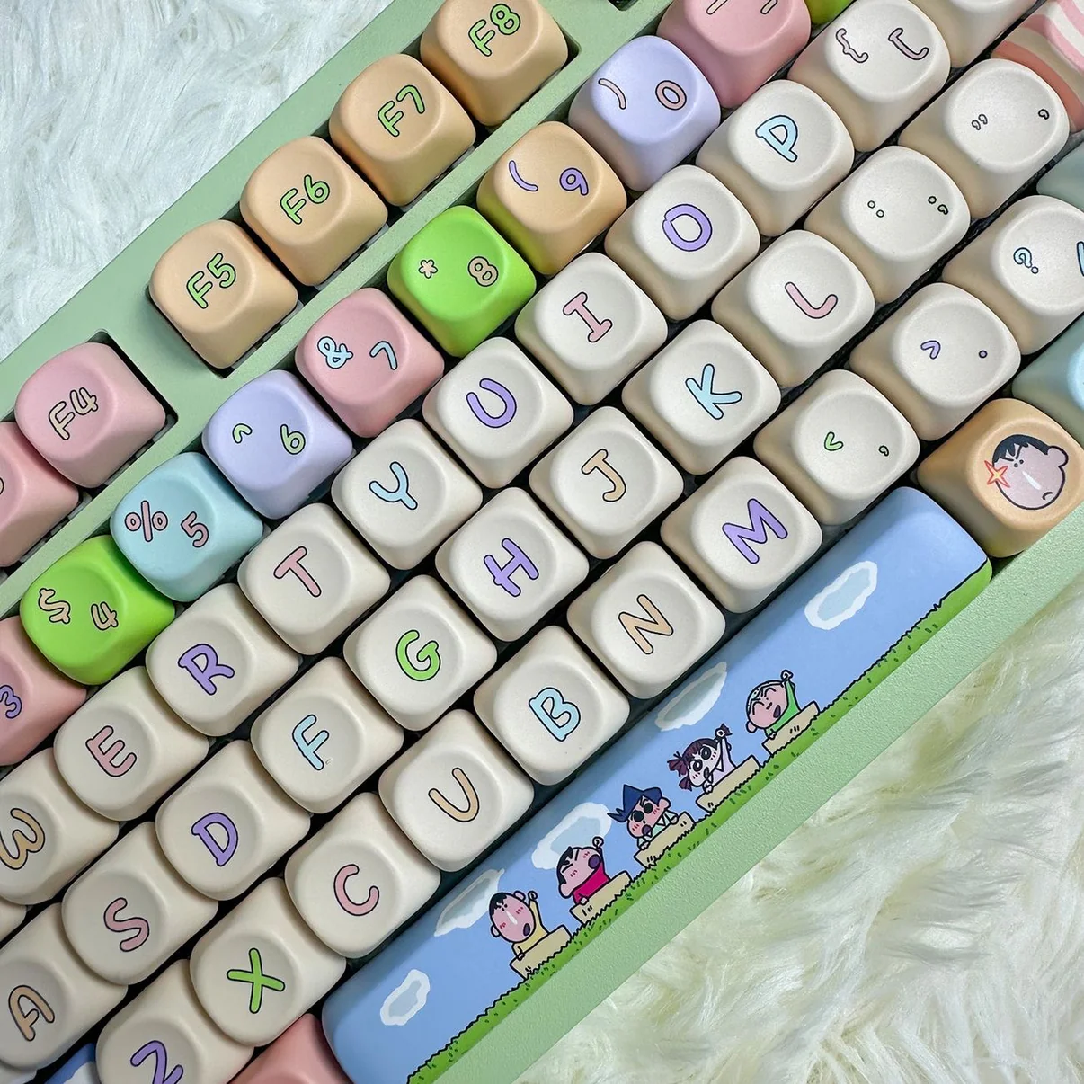
Punchy accents—melon, cobalt, lilac, coral—wake up a neutral desk without taking over. Let a single bright family star (accent arrows, escapes, or a space bar) while the rest stays muted. It’s a move that says “I’m focused, but not boring.” Ideal for startup energy, study nooks, and anyone whose to-do list needs a tiny confetti cannon between tasks.
Match Your Space: A Quick Pairing Guide
- Scandi bright: White walls, pale wood, lots of daylight. Go for YMDK soft whites, light greys, or creamy retro sets. Your keyboard will dissolve into the light and keep the room’s floaty feel.
- Modern monochrome: Black fixtures, framed prints, angular shelves. Deep charcoal or true black sets anchor the desk and tie into hardware—sleek, decisive, low-drama.
- Eclectic cozy: Plants, books, layered textiles. Warm-beige or olive-tinged sets echo the natural palette and make the keyboard feel like part of the living.
- Bold creative: Colorful art, patterned mat, statement lamp. Pick a mostly-neutral YMDK set with one intentional accent shade—let that accent talk to your poster or desk mat stripe.
Texture You Can Feel (and See)
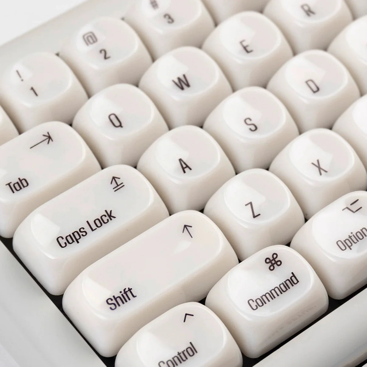
Texture changes perception. A velvety, matte surface softens light and reads “calm.” A slightly crisper finish throws highlights, adding snap to legends in photos and under cool LEDs. Neither is “better”—it’s about how you want your desk to feel at 8 a.m. Matte for meditative mornings; a brighter surface for fast-moving afternoons. Many YMDK sets keep shine down so the color story, not reflections, runs the show.
Legends That Pull Their Weight
Crisp legends are like good typography on a book cover: you don’t analyze them, you just trust them. The latest YMDK arrivals lean into clear, balanced legends that stay legible across lighting shifts—from warm lamps to bright daylight to RGB splashes. If you’re a late-night editor, pick a scheme with high-contrast alphas and calmer modifiers; your eyes will thank you when the clock hits “one more paragraph.”
Build Your Look Around the Caps
- Case pairing: Dark case + dark caps = monolith. Dark case + light caps = graphic pop. Light case + light caps = airy calm. Light case + dark caps = modern contrast.
- Desk mat synergy: A mat is the color bridge. Choose one stripe or micro-pattern that repeats a shade from your YMDK set—suddenly the whole desk composes itself.
- Lamp color temperature: Warm bulbs flatter creams and olives; cooler bulbs make greys and blues feel sleek. Adjust bulb temp before blaming your caps for “looking off.”
- Cable & accessory echo: A coiled cable in a single accent color (pulled from your set) locks the palette. Add a small pen cup or coaster in the same tone for cohesion.
New-Arrival Use Cases (So You Can Picture the Fit)
- WFH calls all day: Minimal monochrome YMDK caps keep the frame professional and distraction-free. Your keyboard stops shouting; your presence reads polished.
- Student grind: Playful pop sets make long study blocks feel less… gray. Color-cued keys nudge your focus back on track between tabs.
- Design sprints: Retro warmth turns frantic deadlines into “I’m in my studio” rituals. Everything feels intentional, not improvised.
- Content creation: Crisp legends and a color-coordinated mat make top-down shots sing. Your keyboard becomes a brandable element—consistent, photogenic, yours.
Care That Keeps the “New” Feeling
- Weekly quick-clean: Soft brush pass to lift dust, then a light microfiber wipe. It’s the difference between “fine” and “wow.”
- Monthly freshen-up: Pop a few caps (the ones you hit most), dip in mild soapy water, rinse, air-dry fully. Rotate positions if you like micro-variations—fun and functional.
- Spill strategy: Pause. Blot gently. Remove affected caps for a deeper clean. Patience beats panic every time.
- Sunlight smarts: Direct sun shifts how any surface ages. Rotate the board occasionally or pull the curtain a touch during peak hours to keep tones even.
Little Styling Tricks with Big Payoff
- The 80/20 palette: Let 80% of the board stay neutral; spend your 20% on accents that match art or peripherals.
- Row rhythm: Group accent keys along a single row (top or nav) for a graphic stripe; it reads cleaner than scattered sprinkles.
- Photogenic corners: Angle the board so light grazes the caps, not blasts them. Shadows are your friend—they reveal shape and texture.
- Seasonal refresh: Swap only the function row or arrows when you want a mood change without a full rebuild.
Conclusion
A great key set doesn’t need to explain itself; it just makes you want to type. YMDK new arrivals give you the palette to design that feeling—calm monochromes for deep work, retro warmth for creative flow, or bright accents for momentum. Match your caps to the room’s light and materials, anchor them with a mat and case that echo the palette, and keep a simple care ritual in your calendar. Your desk will look more intentional, your photos will look more put-together, and your day will enjoy those tiny “I love this” moments every time your fingers hit the keys.
FAQ
- How do I choose a colorway that won’t get old fast?
Start with a neutral base (greys, creams, charcoals) and add one accent family. It stays timeless while giving you room to play. - What if my desk is already busy with plants and books?
Pick a calm YMDK monochrome set; it quiets the surface and lets the rest of the scene shine. - Can I mix sets without it looking chaotic?
Use one constant (all neutral alphas or one accent color) and change the rest. Repetition turns “random” into “intentional.” - Will bright caps look harsh under cool LEDs?
They’ll look punchy by design. If that’s too much, soften with a warmer bulb or a matte desk mat to absorb some sparkle. - How do I match my caps to a specific poster or mat?
Eyeball one shared hue—doesn’t have to be exact. Echo that hue on accents (arrows, escape) and keep everything else neutral. - What if I want seasonal changes without buying tons of sets?
Rotate a small accent kit—numbers, function row, or arrows. One swap can refresh the board’s entire mood. - Do textured caps feel “slower” to type on?
Not in a bad way—matte surfaces can feel more controlled. Choose the finish that matches how you like to work: glide vs. grip. - How do I keep legends crisp over time?
Gentle cleaning and avoiding abrasive cloths is 90% of it. Store spare caps in a pouch so edges don’t scuff each other. - I share the desk—what’s a safe choice?
A neutral YMDK set with a single, subtle accent. It suits multiple tastes and spaces without feeling generic. - What one habit keeps my setup photo-ready?
A two-minute Friday reset: brush, wipe, align, and nudge the board to catch good light. Small ritual, big mood.

